Investment portal & personal quarterly reports
Your legacy Parsec client portal is where you can access your investment quarterly reports, your custodian monthly report, view performance and transactions, and see your account balances – all in one place.
We will be changing portal software at some point in the future. Our best guess is that the current portal will be unchanged through mid-2024, but we’ll let you know more when we have a definite date.
NOTE: If you don’t have a login to your client portal, contact your client service specialist and request a login.
Access your accounts via your chosen provider
eMoney financial planning portal
eMoney is the software we use to create and maintain your financial plan.
How to read your Modera financial quarterly reports
You receive quarterly portfolio reviews from us if we manage any assets on your behalf. We believe these reports are a value-add and an important part of your overall client experience, thus want to make sure you a) know they exist and b) understand what the reports say and how to interpret them. Below we suggest four things to do when you view these reports:
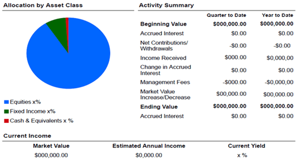
1. Do a birds-eye-view assessment of your portfolio’s total market value and compare current quarter versus year-to-date.
The “Allocation by Asset Class” circle graph gives you a breakdown of your asset allocation, reflecting how much equity compared to bonds/fixed income you have in the account. This was determined in your financial planning process and can always be revisited if you have a change in your financial circumstances. If so, please discuss with your advisor.
The “Activity Summary” section on the first page of your report displays the most recent period’s performance and compares it to that of the full year. Thus, the numbers will be identical in the first quarter’s report, but in the Q2, Q3 and Q4 reports it will highlight both views, which can help identify high-level performance trends in your portfolio. At the bottom of this sample is the Estimated Annual Income, which is an estimate of your annual income (interest and dividends).
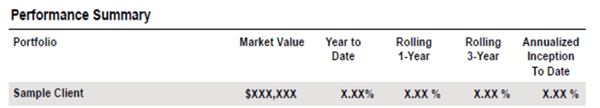
2. Review the performance summary.
On this page you will see the total value of your accounts and how they performed over various time periods. The consolidated performance number (in the gray shade at the top) is reported net of fees. Towards the bottom of this page we break out the performance of the three categories of equities, bonds and cash. These subcategory returns do not have fees removed.
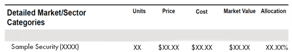
3. Browse your allocation breakdown and investment holdings.
As you flip through the next couple of pages you will see details of your portfolio account. First, we display your portfolio allocation by market/sector categories. Our investment team has a robust process to determine the exact mix for each portfolio.
Per the sample below, within these tables on the left-hand-side you can see the name of each investment followed by its “symbol” or “ticker” in parentheses. This is typically one to five letters long, and you can search that symbol online to learn more about the investment via a reputable source.
As you move to the right you will see how many units/shares you own, the price per unit/share on that day and the cost. The last two columns are market value, which is the value of the holding on the day the report was run, and allocation, which is the percentage of that investment in your total portfolio. Comparing the market value to the cost will tell you on that day if there is an unrealized gain or loss.
4. Last but certainly not least, see our fees assessed.
We provide a breakdown of our most recent fees on the last page of each report. We work hard to earn these fees and we hope you always see value in the service we provide. If you ever have any questions on the fees issued, please contact your financial advisor.
We hope you find this overview helpful!